UX Research & Design - Client Project | Feb 6 - May 2, 2024
Is Exploring Content Intuitive on Words Without Borders?
Bhavna, Hugo, Charlotte, and Jimin

Abstract
Our project centered on optimizing user engagement and accessibility for Words Without Borders (WWB), an online platform providing global literature primarily accessed via desktop. With the aim of enhancing content showcase and increasing user retention, we employed diverse research tools to analyze user behaviors and visual attention. Our findings offer insights into areas for improvement and successful aspects of the platform

The team I was in
Our group name is Storytellers, and we are a group of 4 people: Bhavna, Hugo, Charlotte, and Jimin(me). Bhavna was the administrator, Hugo was the editor, Charlotte was the manager, and I was the Facilitator.
My role in the group
My role was to ensure we were on track and to know what tasks had to be done by whom, such as how to split the work. I mostly organized our tasks to-dos and kept reminding the group. I encouraged and sometimes pushed the group to move forward.
What we tried to achieve
Help WWB improve the way they showcase content and increase user retention.

Journey we went through
Initiate Project with Words Without Borders Client
Define Research Questions and Objectives
Utilize Analytic Tools for Preliminary Insights
Present Initial Findings to Client
Develop Eye-tracking Test Plan (Recruitment, Scenario Creation)
Execute Eye-tracking Test Sessions
Analyze Results and Identify Key Insights
Generate Recommendations Based on Prioritized Findings
Prepare and Deliver Final Presentation to Client
What were the client's expectations
Gain a comprehensive understanding of overall user behaviors.
Enhance accessibility to the archives by improving the search function, information architecture, and home page content display.
Expand the offering of audio and video content.
How we set our objectives
We are studying users' behaviors and visual attention on the Words Without Borders desktop website because we want to find out how users navigate the site to find meaningful content so that we can help WWB improve the way they showcase content and increase user retention.
Given the broad nature of our client's objectives, we carefully refined our research goals. This process was driven not only by time constraints but also by our intention to align our research objectives with the capabilities of the specific methods we employed, eye-tracking and analytical tools.
How we framed our research questions
1
How do users currently navigate the website, and what factors influence their navigation choices?
This question aims to understand user interaction with the website's search feature, home page, and article pages.
2
How effectively are users engaging with the content, and how is it performing?
This question aims to evaluate user engagement with the content and its overall performance.
3
How well does the homepage communicate WWB's primary purpose to new users? What is WWB's product offering?
This question seeks to assess the effectiveness of the homepage in communicating the organization's primary purpose and product offering to new users.
How we set up our study
Methodologies we used


Quantitative Analytics Tool,
Google Analytics
Eye Tracking with Retrospective Think-Aloud Usability Testing


Scenario 2:
Imagine you have recently been exposed to literature from around the world and are interested in reading more global content.
Task:
Find a piece of Canadian literature.
Scenario 3:
You are looking for inspiration related to "Dream" and are exploring poetry and fiction that interests you.
Task:
Find a piece of fiction related to 'Dream.'
Scenario 4 & 5:
Imagine you have just found out that Words without Borders offers multilingual/multimedia content. You are excited to find more examples of them.
Task:
Find an article piece that supports multilingual/multimedia features.
Browse through the article piece you found.
Try to see the original language (multilingual)/Try multimedia content.
Behavior Analytics Tool,
Hotjar
Quantitative Usability
Metrics
Who we recruited for the eye-tracking test

Challenges when recruiting
Despite emailing the Pratt community and having individuals share the opportunity on their social media platforms, such as LinkedIn, we were unable to find two additional returning users. Therefore, we decided to recruit two more new users instead.
What I did: Fortunately, since the returning user I contacted responded promptly, I was able to conduct the eye-tracking test during the week we sent out our initial test invite.
How we conducted eye-tracking test and retrospective think aloud session
Scenario 1:
Imagine you are interested in reading digital literature, and your friend introduces you to a literature website called "Words without Borders." You'd like to check out this website and see what it offers.
Task:
Search for Words without Border through the desktop browser and take a moment to familiarize yourself with the homepage and the product.
Browse through the website and find a piece of poetry that interests you.

Intention
Observe how users interact with the search feature, home page, and literature pages. We wanted to find out:
Which pages/components do users interact with first?
What is the average time taken for users to reach the article page by browsing?
What percentage of users initiate their website experience with a search?
Intention
Since WWB is mainly targeting global content, we wanted to see if users would easily navigate the website's core offerings if they use it with confidence, as well as the search process.
Intention
This task aimed to observe user search behavior for "Dream." While our hypothesis expected search box usage, some participants used the navigation bar instead. This divergence highlights how previous tasks influenced user behavior, emphasizing the importance of understanding user habits.
Intention
The intention for scenarios 4 and 5 can be explained together. The client wanted audio & video content offering expansion; we tried to verify if the multimedia content is easily discoverable and used effectively.
Why did we also test multilingual? Not only is WWB aiming for global content, so it should be found quickly and expand the users for these archives, but it also uses the same tag layout structure. Basically, we wanted to validate if the current design is prominent enough so it is accessible enough.
I focused on ensuring that our scenarios and tasks could be an answer to the research questions. Also, I ensured we didn't test it with eye-tracking methods to see if other research methods, such as GA4 or Hotjar could answer it.
How did MY eye-tracking test go?
I conducted eye-tracking tests with one new user and one returning user. The new user, a Pratt IXD student, provided transparent feedback, highlighting issues such as the lack of intuitiveness in the term "multimedia." The returning user, a professional designer, offered insights into design-related challenges, such as disorientation caused by the grid layout. While both tests went smoothly, participants focused more on completing tasks than exploring the website out of personal interest. Additionally, sitting at a fixed distance from the screen during testing was uncomfortable for participants.

Overview of the Findings
After analyzing user behavior using Google Analytics 4 and Hotjar, and conducting eye-tracking tests with six new and returning users, here's what we found:
What is working well
Large font size and good contrast for accessibility.
Multilingual feature for language learning.
Vast variety of content, including international literature.
Clear navigation bar aiding website understanding.


Overview of Major Findings
Multimedia/Multilingual content lacks accessibility, consistency, and user-friendliness.
User confusion arises from inconsistent use of filters and search results.
Users experience disorientation due to the website's confusing layout and content organization.
6 of 8 eye-tracking testers had trouble finding multimedia content in the first place.
4 of 8 eye-tracking testers tried the Navigation Bar to find Multimedia.
Finding 1:
Multimedia/Multilingual content is not as accessible, consistent, or user-friendly as it could be.
Users do not know how to locate multimedia content.
It took an average of 1 minute and 38 seconds to find it.
6 of 8 eye-tracking testers had trouble finding multimedia content in the first place.
An example how users navigate the site when they are trying to find the multilingual/multimedia content.
Then, where do users expect to find the multilingual/multimedia content? Where do they browse and navigate?
6 of 8 eye-tracking testers tried to go to the Navigation Bar to find Multilingual.
4 of 8 eye-tracking testers tried to go to the Navigation Bar to find Multimedia.
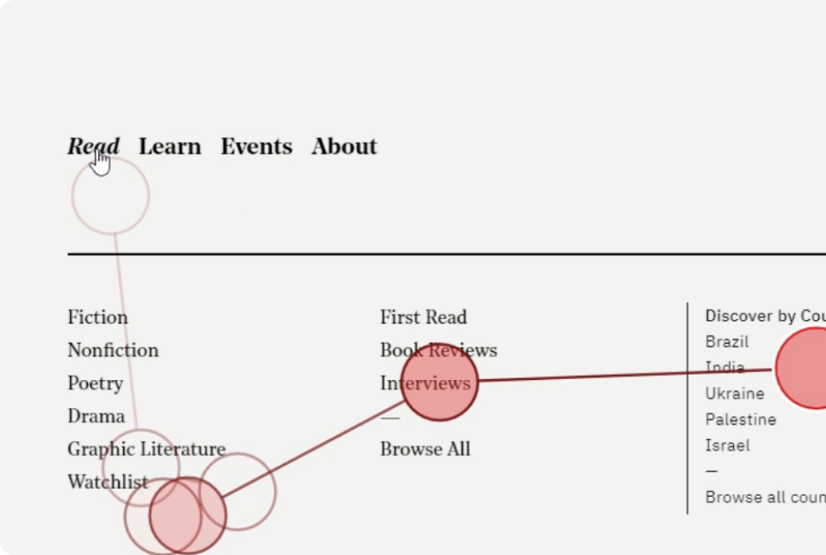
An example how users tried to find multilingual/multimedia in the navigation bar.
Additionally -
Not all users can understand the meaning of "multimedia" intuitively.
“I wasn't even sure what multimedia means. Does it mean there's like poem and fiction? Or pictures?”
- Participant
The tags for multimedia and multilingual are not noticeable.

Heatmap showing how multilingual and multimedia tags are
NOT noticed enough by users.
Recommendation 1:
Label multimedia more intuitively and include it in the navigation bar.
Since users tend to check out the navigation bar to find multilingual/multimedia content, make it accessible there.
Also, as some find the wording ‘multimedia’ not intuitive enough, add “audio/video” to set proper expectations.

TO-BE
In the card design -
Reposition, add icons, and label them intuitively.
As the tags are not noticeable enough (and to achieve the client’s goal), reposition tags where they will be more noticeable. Also, adding icons allows users to set more accurate expectations of the offerings.

AS-IS

TO-BE
All the users who visited the fiction page were expecting to find filters.
“After typing ‘fiction,’ the fiction genre was not selected automatically, requiring manual selection.”
-Participant
Finding 2:
Inconsistent experiences with using filters & search results caused user confusion.
Filters are only available on the Search page, not the primary pages.
It creates a gap between user expectations and the experience, as well as difficulty navigating the content. Two users went to the fiction page when they were trying to find fiction related to ‘dream,’ and all of them looked for filters but couldn’t, so they went to the search page.
Here’s one of the participants’ quotes: “Why was the filter option only available on the search results page and not on other pages?”
An example how users went straight looking for a fiction related to 'dream' in the fiction page and looked for filters.
Users get confused because the search results do not always reflect the search keywords.
They had to recheck the filter box to narrow down the search manually.
An example shows how they have to check ‘fiction’ even though they searched for ‘filter’ in the search box.
Recommendation 2.1:
Add filters to other main pages.
This is not only because users expect to find filters on other major pages but also to enhance the search experience and consistency; having a filter section on other pages will benefit the user experience.

TO-BE
Recommendation 2.2:
Incorporate the most used keywords of literature.
The search results should not have this much gap.
Users see
634 results
when using search & filters
Users see
2 results
when themes
To achieve one of the major goals, which is improving content showcase, fixing this problem is crucial, even though it is a backend fix. Showcasing more related options will allow users to identify the vast amount of resources available on the website.
All the users who visited the fiction page were expecting to find filters.
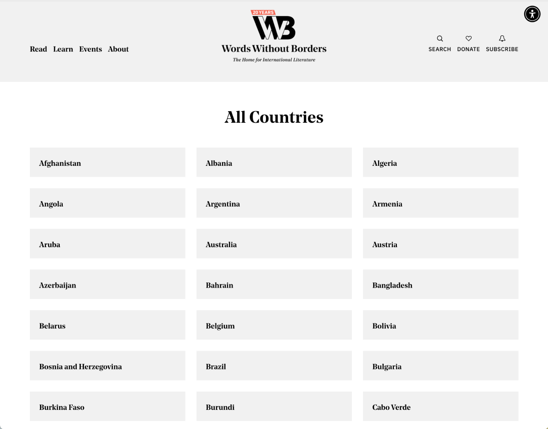
"The 4-column grid design feels too spread out and disorienting. It's arranged alphabetically instead of geographically, making it
hard to find Canada quickly."
- Participant
An example shows how users have to manually go through the grid-layout to find a keyword + user’s detailed quotation.
Finding 3:
Users feel disoriented due to the confusing layout and content organization.
i.e., Homepage
Users struggle to identify categories, particularly distinguishing headlines, due to inconsistency, such as the orange background headlines. (It is NOT unnoticeable; people see it but don’t recognize it as a headline.)
Here’s one of the participants’ quotes: “I don't really know which one is the headline of the category... like the headline with the orange background, it's quite confusing.”
An example shows how users see the headlines but can still not distinguish which headline belongs to what section.
Below are examples of the inconsistent headlines on the homepage.

An example demonstrates that most users will only view one complete piece of content and two partially displayed pieces on the homepage.

Below shows how much of the content most of the users will end up seeing on the homepage.

i.e., List Page (All countries)
The current layout of the list page is not optimal because users have to manually browse through it, which requires considerable effort.
Also, it took an average of 1 minute and 10 seconds to complete this task.
Recommendation 3.1:
(Homepage) Keep the section layouts consistent and adjust the visual hierarchy.
Prioritizing user understanding of the website's structure is more important than emphasizing specific promotional content for the business. So, having consistency should be fixed first. (Also, visual hierarchy refinement is required.)

AS-IS

TO-BE
In addition, ensure that there is more meaningful content on the top section of the homepage.
Recommendation 3.2:
(Country List Page) Implement interactive maps, searches, and filters.
With this, users can also navigate through countries geometrically. Including a search box and filter option will help users find desired content quickly and easily.
AS-IS


TO-BE
If we were to continue working on the project
The next steps would involve implementing recommendations derived from our research, conducting further user testing and iteration, and analyzing whether these recommendations increase user retention and decrease confusion on the platform.

Takeaways
About methodologies
Our group gained insights into the tools and methodologies. Google Analytics offered broad user data, eye tracking, and retrospective think-aloud testing, which provided deeper insights into behavior and preferences. Hotjar's behavior analytics complemented these findings. Combining these tools allowed us to make informed decisions for platform improvement.
Personal lessons
As a facilitator and a designer, I learned the importance of effective team coordination and user-focused design through this project. Coordinating tasks and keeping the team on track requires strong leadership and communication skills. Additionally, engaging myself in user research emphasized the vital part of prioritizing user needs and preferences in the design process. This experience has deepened my understanding of research project management and user-centric design principles.
Explore my other projects, too!
Recent Projects at Graduate School 👩🏻🎓
Oct 4 - Nov 13, 2023 | UX Research & Design - Class ProjectInclusive Dining Experiences for Wheelchair Users
Redesigned Yelp by integrating enhanced accessibility features to address existing issues.

July, 2022 | Front-end Development at BlueBasketBlueBasket’s Website Makeover
Redesigned BlueBasket’s pre-order website using HTML, CSS, JavaScript, and Liquid.
Web Development Project 👩🏻💻

Bootcamp Personal Passion Project 👩🏻🌾
Feb 1 - Mar 30. 2023 | UX/UI Design - Personal Project (Bootcamp)ecoeats - Rescue Food, Reduce Waste
Streamline expiring food discovery for consumers, helping sellers reduce waste and seize revenue opportunities.

Aug, 2023 | UX/UI Design for Apposter, Inc. - TimeflikTimeflik’s Complicated New Membership Plan
Crafted the UX/UI design for a new membership plan within the mobile app Timeflik.
Professional Work in Real-world Industry 👩🏻💼
