UX/UI Design - Professional Work at Apposter, Inc. | Aug, 2023
TIMEFLIK’s Complicated New Membership Plan
Collaborated with Android Engineers, Project Manager, and UX Team Manager
Background
TIMEFLIK offers personalized or downloadable watch faces, which are wallpapers for smartwatches. However, customer satisfaction suffered due to subscribers' confusion about the subscription plan and policy details. Many users believed certain features were included in their subscription, only to discover otherwise. To address this, the company and I conducted various types of research to understand user pain points and needs. Also, as the sole UX designer, I redesigned the sign-up flow to be more intuitive and concise, ensuring clear communication of the subscription plan details.


My Role
Served as the sole designer for this project, taking end-to-end responsibility.
Collaborated closely with the project manager on shaping the business side for the new membership plan.
Worked closely with Android Engineers to verify aspects like the new sign-up flow for various user cases and gained insights into effective practices and challenges when working under tight deadlines.
Project Goal
Simplify the sign-up flow to minimize steps and enhance user efficiency.
Implement intuitive design choices to facilitate quick and easy navigation.
Ensure transparency in the user experience, avoiding prompts that steer users towards more expensive membership options.
Enhance user comprehension of the new plan by enabling swift and easy comparison between different membership options.
Project Journey Following User-Centered Design Principles
Understanding Users:
Utilized analytic tools and data from customer service specialists to comprehend the behaviors and preferences of current subscribers.
Conducted workshops to deeply understand users' current pain points, needs, and wishes for the next membership plan, creating personas for app users, artists who sell their watch face designs through the platform, and stakeholders.
Competitive Analysis:
Conducted a competitive analysis to learn from user-friendly membership plans that have been successful in the market.
Ideation and Prototyping:
Ideated concept prototypes collaboratively with the project manager and Android team manager.
Ensured alignment of the user flow with engineering requirements and identified any potential restrictions from the engineering side.
Wireframing and Iteration:
Started from mid-fidelity wireframes to gain a better understanding of the user flow, considering all possible demographics.
Iterated designs as needed based on feedback from the project manager and engineers.
Development and Testing:
Engineers developed the designs while ongoing iterations were made as necessary.
Conducted extensive testing with the designated team members to consider all demographics and refine the user experience further.
Three Project Challenges and Our Decision to Overcome
1
🥵 Challenge: The current introduction screen lacks intuitiveness for first-time users.
😎 Solution: Summarize benefits, employ a clear comparison table, use straightforward layouts, and minimize click steps.
🙋♀️ Why? To enhance user experience, focus on simplicity and clarity in the sign-up process.
2
🥵 Challenge: Multiple user cases to consider: current plan transitions, four new membership plans, coupon users, free-trial users, etc.
😎 Solution: Developed comprehensive documentation for designers, PMs, and engineers to ensure alignment and serve as a reference.
🙋♀️ Why? To prevent disruptions in user experiences and potential user loss, it's crucial to account for all user cases in the documentation.
3
🥵 Challenge: Designing a page for users to compare plan differences.
😎 Solution: Use intuitive, differently colored icons to represent key features. Reinforce understanding by providing captions for each feature.
🙋♀️ Why? Differentiating features with colors aids quick identification. Intuitive icons enhance user understanding, further reinforced by captions for clarity.

DESIGN SOLUTIONS
Let’s see how it turned out!
Initial Step
Overall Problems to Solve:
The existing design and flow of the introduction page caused delays in accessing crucial information and transitioning to the next step.
The product comparison from the previous plan does not align with the new membership plan due to its increased options and complexity.
UX writing and typography choices, such as red fonts for terms, have been detrimental to the overall user experience.
It's imperative to illustrate how the new membership plan surpasses the previous subscription plan in terms of value and benefits.
Solutions Overview:
Simplified information presentation for swift and easy comprehension by users.
Icon images were introduced at the outset to familiarize users with the three main features of the new membership plan. Consideration was given to UX writing to strike the right balance between conveying sufficient information and avoiding overwhelming the user.
Utilized an extremely simple chart to depict the two additional options within the new membership plan, facilitating comparison and decision-making.
Highlights
Removed unnecessary illustrations to minimize scrolling, allowing users to absorb key points quickly.

Opted against adding smartwatch-related visuals, as users can easily recognize the app.

To clarify the differences between the four membership plans during the registration process, introduced key features with colored icons. (Simplified icons will be used in subsequent pages.)

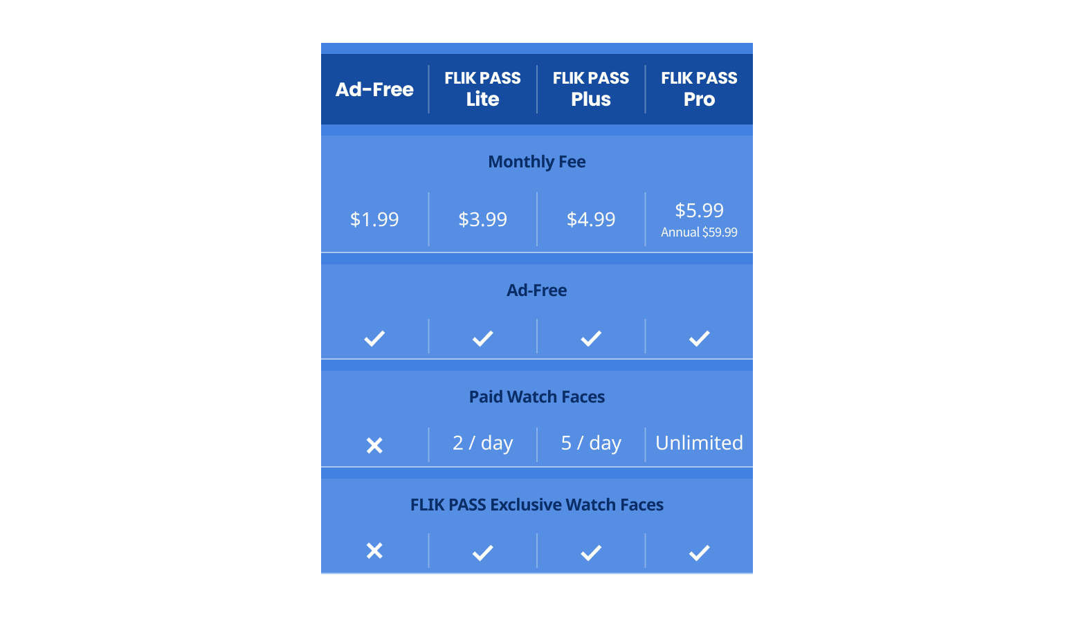
Designed a simple comparison table for easy understanding.


After
Before
Plan Selection
Overall Problems to Solve:
The existing design required users to click excessively, which may have been perceived as overly complicated. From a business perspective, this could potentially lead to undesired outcomes.
Users found it difficult to swiftly compare the various plan options, especially since the new membership plan offers four options instead of two.
Solutions Overview:
Simplified the flow by reducing the number of clicks required. Users can proceed to the next step with just one button click.
Implemented a color-coded icon for each main feature, facilitating easy comparison between different plan options. Placing all options on the same page further enhances user convenience.
Highlights
The earlier design made users go through multiple clicks to select a plan and start a free trial. For instance, to choose the "Lite" plan, users had to navigate tabs and buttons across screens. To simplify this, all plans are now on one page; users just need to click the final button to select.

Introduced key features with simplified, color-coded icons, making it easy for users to compare plans swiftly.

Highlighted a recommended plan to align with the business strategy.
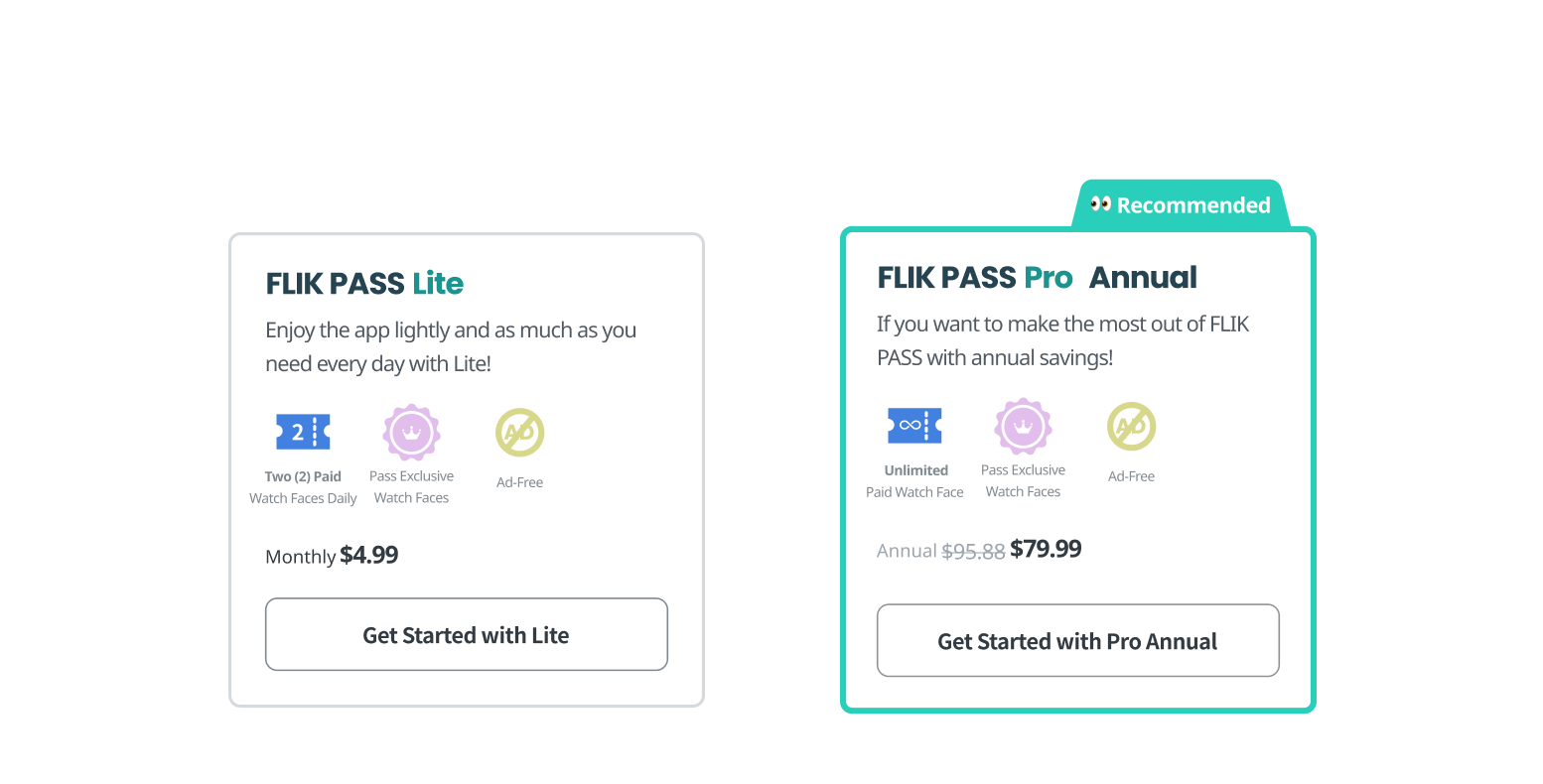
To reduce the overwhelming use of the main color, mint, in the previous design, minimized the use of primary color.
After
Before


After Checkout
Overall Problems to Solve:
Lack of design elements to remind users of what they will receive with their selection.
Excessive use of the primary color, potentially overwhelming the user.
Challenges with text layout arising from the inclusion of multiple language packs.
Solutions Overview:
Implemented a hierarchical design structure to clearly and promptly display users' choices.
Consistently used the same icon for features, aiding users in understanding what to expect.
Reduced the excessive use of the primary color of the product to create a more balanced and visually appealing interface.
Highlights
By consistently using the same color-coded icons, users are effectively reminded of the features they can make the most out of in their selected plan.
Implemented a separate success screen specifically for users who chose the ad-free plan.
Overcame the extensive use of the main color, mint.

Before
After


Success screen for regular membership selection
Success screen for ad-free plan selectionPlan Changes
The screens current subscribers encounter after clicking their current plan name on their account page.
Highlights
Prioritized the plan name and price in the card design ensures a user-friendly experience.

Openly displayed downgrade plan options for transparent and ethical design.
Distinctly presented the current plan among other options for easy differentiation.

Designed a one-click process on the all-selection page to optimize the changing process, making it quick and effortless for users.
Avoided confirmshaming and respecting users' decisions, particularly when downgrading their plan (in the dialogue.)
Assured users that their current plan will be prorated and seamlessly applied to the next selected plan.
1. Details of the current plan with a button to initiate the plan change.

2. All available plan options

3. Confirmation dialogues

Paid plan user
Free trial userMy Personal Takeaway
It was fulfilling to contribute to the business plan. I'm grateful for the opportunity to share my opinions and gain insights into the perspectives of project managers and developers.
This project marked my first close collaboration with a designated project manager. I learned valuable considerations, such as settlement processes for contractors, customers, and internal staff in the context of new membership plans.
I feel a sense of accomplishment having been involved in the entire design process, from initiation to completion.
My skills in designing user flows and task flows have noticeably improved.
I've learned how to effectively collaborate with engineers using tools like Figma.
Explore my other projects, too!
Recent Projects at Graduate School 👩🏻🎓
Oct 4 - Nov 13, 2023 | UX Research & Design - Class ProjectInclusive Dining Experiences for Wheelchair Users
Redesigned Yelp by integrating enhanced accessibility features to address existing issues.

July, 2022 | Front-end Development at BlueBasketBlueBasket’s Website Makeover
Redesigned BlueBasket’s pre-order website using HTML, CSS, JavaScript, and Liquid.
Web Development Project 👩🏻💻

Bootcamp Personal Passion Project 👩🏻🌾
Feb 1 - Mar 30. 2023 | UX/UI Design - Personal Project (Bootcamp)ecoeats - Rescue Food, Reduce Waste
Streamline expiring food discovery for consumers, helping sellers reduce waste and seize revenue opportunities.

Oct 26 - Dec 8, 2023 | UX Research & Design - Client ProjectKnowunity's Unrealized Potential
Improved the onboarding process to bridge the gap between user expectations and experiences.
