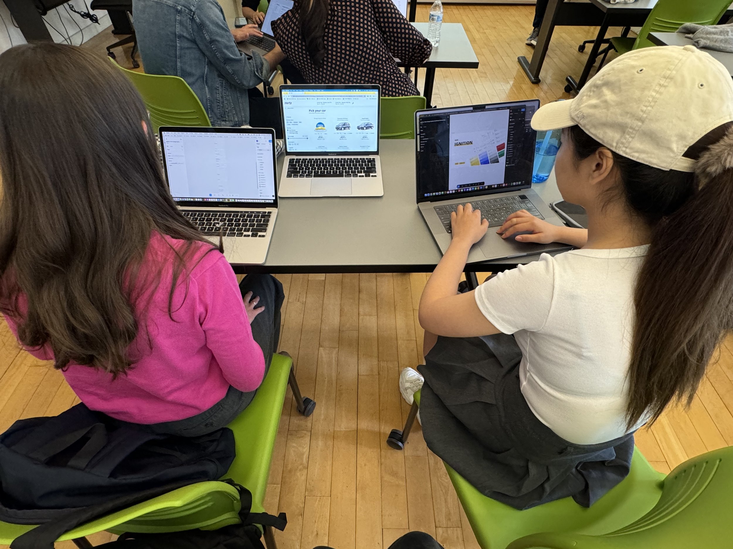
Ignite Hertz’s Design System

As a group of four UX designers, we built a design system for Hertz’s website to enhance consistency and efficiency.
Team
Jimin Hong
Nidhi Gowda
Kiyo Yang
Sakshi Sonawani
Duration
Sep 2024 - Dec 2024
Tools
Figma and Zeroheight
Hertz is a global car rental company that provides vehicle rental services to travelers and businesses worldwide.
So why Hertz needed a new design system?
Hertz’s website has a well-established and distinctive brand identity overall. However, we identified some significant issues regarding the design systems, such as inconsistent design elements within user flows and a lack of design structure.
Therefore, we considered this a great opportunity to improve Hertz’s design system for business customers and internal designers, developers, and any other cross-functional teams.
We took a closer look at the current design elements and broke it down.
We destructured all the design elements on our focused pages by individually screenshotting elements like color, typography, buttons, etc.
Look at the image below! There are too many variations, and it is very inconsistent overall.


These findings highlighted an urgent need for Hertz’s website to adopt a unified design system for a smoother experience.
While analyzing the existing structure, we have already started developing better ideas like minimizing the variations in typography, having a consistent width and radius for buttons, and systemizing the input fields and forms.
Then, we brought everything together and turned it into a UI Inventory.
With all the issues we invested in and analyzed, we consolidated the elements and categorized and identified them better structurally. It was a great opportunity for us to align our standards for categorizing the widespread, unidentified various elements and narrow down the directions on how we should strategize for our new design system.

Now, it's time to build a new design system for Hertz!
We resisted the temptation of starting with every shade of our primary color first and began with a broader perspective.
Setting foundations with actual values from the beginning did not seem possible because we still don’t know how many we need or their range. So, we backed up and started with the bigger picture.
With what we learned from the previous activity of deconstructing and analyzing Brad Frost’s Atomic Design, we began with a broader perspective, even though we were tempted to create five shades of yellow.
We divided the structure as follows.
Foundations: colors / elevations / grid / icons / logo / spacing / typography
Components: breadcrumbs / divider / buttons / cards / carousel / checkboxes / chips / date picker / filter panel / footer / dropdowns / input fields / modal / navigation / radio buttons / slider
We wished we perfectly arranged all the atoms before building the molecules, but that wasn’t the case. So we used reverse engineering.
We noticed that most other design systems included various shades of primary and secondary colors, and we wanted to incorporate that as well. Defining the Hertz primary color was straightforward; however, they didn’t utilize any shades, and we lacked good existing examples to draw from.
As a result, we established the shades roughly, using the examples from other design systems, with the understanding that they could always be updated later.
Ultimately, we decided to shift our focus away from building atoms based on assumptions. Instead, we moved forward to create molecules, and based on actual use cases, we developed a set of atoms.
* While we built all of our components, we conducted accessibility tests through helpful resources like WCAG to ensure they were used inclusively.
Our goal is to improve clarity in design choices through strategic token development.
We have always kept in mind the importance of building tokens alongside our design process. While we are in the phase of creating some basic elements, such as atoms and molecules, we have also begun to establish variables in Figma.
Through our discussions, we learned that there is no definitive right or wrong way to structure tokens; it ultimately depends on the characteristics of the website. After extensive conversations, we decided that our tokens should enhance clarity for users, specifying what to use and when, rather than causing confusion. This approach effectively eliminates instances where designers base their choices solely on subjective assumptions.
Despite the considerable effort required, we successfully created and assigned tokens to each component accordingly.


Midpoint Reality Check: Let’s test our design system
We published our design system in the Figma Community and invited users to test it by trying to build our most important page: vehicle selection.
From this testing, we learned a lot. It was interesting to see how differently people used the design system. Some users relied on the design file, where we laid out all the components, while others used the token names, often searching for components by typing in the search bar.
Many testers raised concerns about responsiveness issues. Some felt confused by the significant differences between the current design and the new design, particularly regarding font sizes.
We gathered this invaluable feedback to enhance the user experience of our design system.


Finalized the design system
After numerous iterations, we finalized our design system. With that in place, we set out to construct two fundamental pages: the landing page and the vehicle selection page, utilizing the newly systemized components. We believe this new approach will significantly enhance user experience and streamline interactions.

So, where can you find our design system?
We created a documentation for you!

Documentation can be user-friendly.
After creatively naming our design system ‘Ignition,’ we thoughtfully planned how to make this documentation user-friendly. Our goal is to ensure that users can easily navigate the information they need.
To achieve this, we’ve structured the documentation to clearly outline the purpose and usage of each component, as well as the scenarios in which they should be applied. We took into consideration the various users of the documentation, including new employees and designers working on specific projects, like the electric vehicle selection page. Knowing where to begin or which vehicle card to utilize is crucial for these users.
Additionally, we’ve included guidance on how team members can reach out to the design system team for support or questions.
Using Zeroheight, we've created comprehensive documentation explaining the importance of the design system for Hertz, our design principles, and all its components. We also cover best practices through clear dos and don’ts and provide useful resources to assist users in their journey.
Lastly, we pitched our new design system.

We concluded our project by presenting it to imaginary internal stakeholders, aiming to validate whether our new design system would significantly enhance Hertz's design operations.
During the presentation, we highlighted how inconsistencies in the current design system negatively impact work efficiency. We demonstrated how our proposed system is well-structured and systematic. We emphasized the benefits of implementing this new design system and how it could improve workflows and the user experience.
To make the presentation more engaging, we began and ended with a quote that illustrated how a good design system is a worthwhile investment that fosters innovation. We used metaphors to convey our ideas, describing the foundational elements as the "nuts and bolts" of the design system and likening the system to an engine and dashboard that deliver a smooth user experience.
Our delivery received positive feedback from the audience, and we hope that the real Hertz team will see the same value and potential in our work.
My personal takeaway. My design mindset has been transformed.
Through this course, I learned and grew a lot. It was incredibly beneficial and helpful to me.
I personally faced many challenges during my summer internship because I did not have sufficient knowledge of the design system. However, I always recognized its importance for designers. Now, I have developed a strong understanding of this area, and I can’t wait to apply my learnings in a professional setting.
Learning practical Figma skills was particularly satisfying. While it’s possible to learn these skills from YouTube, experiencing it alongside my colleagues, implementing and applying the theories directly, and troubleshooting with professionals made a significant difference. Now, my friends who haven't taken this class jokingly refer to me as the "Figma Master."
In addition to the technical aspects, I gained insight into the structure of design system documentation. We analyzed many successful design system documents together, and I now feel confident not only in using existing systems but also in enhancing or even creating new ones from scratch.
Although we did not create a design system on the scale of Atlassian or Material Design, my design mindset has been transformed. I can clearly identify a before and after regarding my experience in this UX Design System course.